Visualising Effects
Thierry Onkelinx
visualisation.RmdThe vignette("classification", package = "effectclass") explains how we can classify effects based on their confidence intervals. This vignette focusses on visualising effect and their uncertainty. The packages provides two ggplot() layers (stat_fan() and stat_effect()) and a scale (scale_effect()).
stat_fan()
The Bank of England visualises uncertainty by using a fan plot (Britton, Fisher, and Whitley 1998). Instead of displaying a single coverage interval, they recommend to display a bunch of coverage intervals with different levels of transparency. stat_fan() creates the intervals based on a Gaussian distribution. It uses the y aesthetic for the mean and the link_sd as the standard error. The default setting in stat_fan() displays three sets of confidence intervals. Setting fine = TRUE yields a set of nine confidence intervals.
| opacity | width around the mean | lower | upper |
|---|---|---|---|
| 90% | 30 % | 35 % | 65% |
| 60% | 60 % | 20 % | 80% |
| 30% | 90 % | 5 % | 95% |
| opacity | width around the mean | lower | upper |
|---|---|---|---|
| 90% | 10 % | 45 % | 55% |
| 80% | 20 % | 40 % | 60% |
| 70% | 30 % | 35 % | 65% |
| 60% | 40 % | 30 % | 70% |
| 50% | 50 % | 25 % | 75% |
| 40% | 60 % | 20 % | 80% |
| 30% | 70 % | 15 % | 85% |
| 20% | 80 % | 10 % | 90% |
| 10% | 90 % | 5 % | 95% |
library(effectclass)
#>
#> Attaching package: 'effectclass'
#> The following object is masked from 'package:base':
#>
#>     unlist
library(ggplot2)
set.seed(20191216)
timeserie <- data.frame(
  year = 1990:2019,
  dx = rnorm(30, sd = 0.2),
  s = rnorm(30, 1, 0.05)
)
timeserie$index <- exp(cumsum(timeserie$dx))
ggplot(timeserie, aes(x = year, y = index, link_sd = s)) + stat_fan()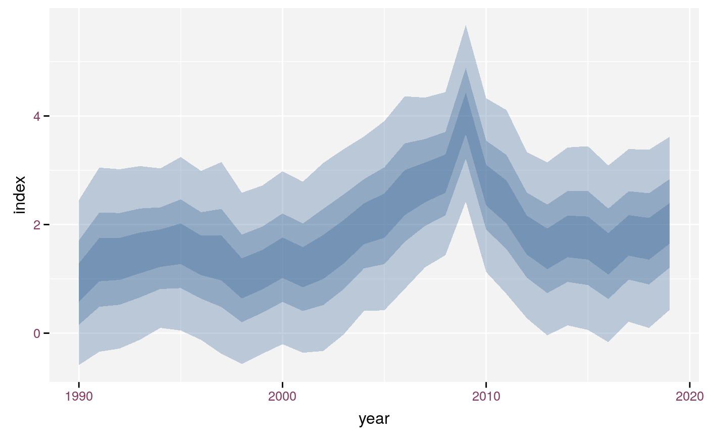
Default plot using stat_fan().
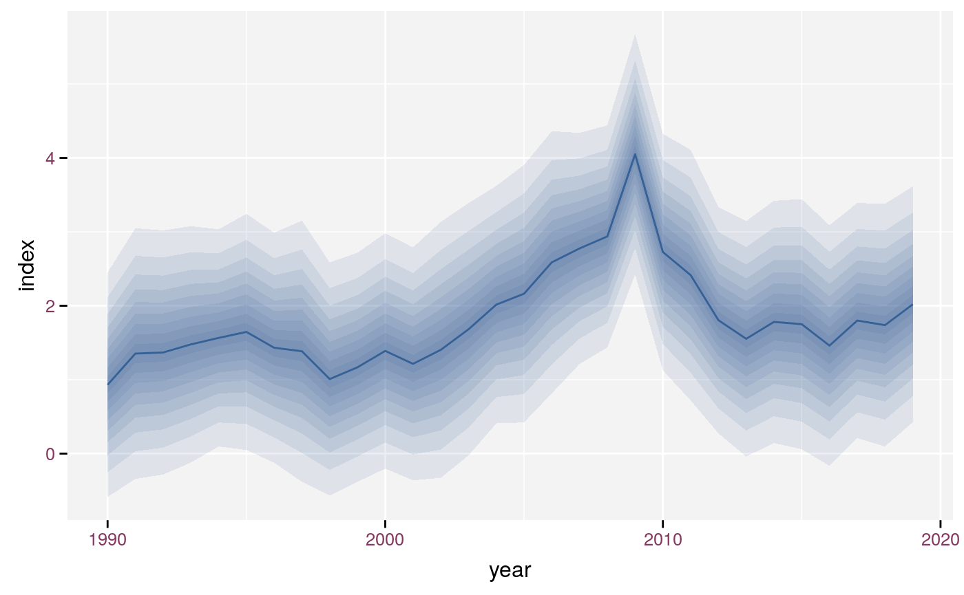
Fan plot with nine intervals and line.
Some statistical analyses require a different distribution, e.g. Poisson or binomial. These analyses often use a link function between the linear predictor and the mean of the distribution. Poisson uses a log link, binomial a logit link. The uncertainty around the predictions of the linear predictor (in the link scale) still follows a Gaussian distribution. However, we want to display the predictions and their uncertainty in the original scale. The link argument stat_fan() allows the user to specify the required link function. stat_fan() then assumes that y specifies the median in the original scale. Hence the confidence intervals in the link-scale use \(link(y)\) as their mean. You need to specify the standard error in the link scale, that why we named the argument link_sd. stat_fan() calculates the intervals based on \(\mathcal{N}(\mu = link(y), \sigma = link\_sd)\) and back transforms them to the original scale. Having y in the original scale in combination with a link function has the benefit that it is easy to reuse the y in other geoms.
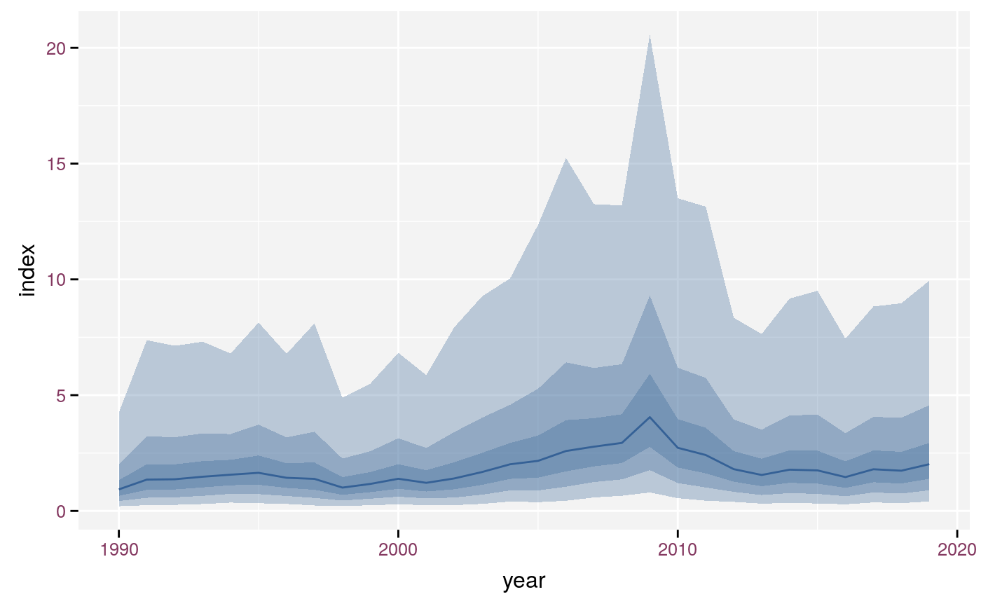
Plot using stat_fan() with log-link. Note the asymmetric intervals due to the link function.
stat_fan() handles different discrete colours as demonstrated in the example below.
timeseries <- expand.grid(year = 1990:2019, category = c("A", "B"))
timeseries$dx <- rnorm(60, sd = 0.1)
timeseries$index <- rep(c(0, 2), each = 30) + cumsum(timeseries$dx)
timeseries$s <- rnorm(60, rep(c(0.5, 1), each = 30), 0.05)ggplot(timeseries, aes(x = year, y = index, link_sd = s)) +
stat_fan(aes(fill = category)) + geom_line(aes(colour = category))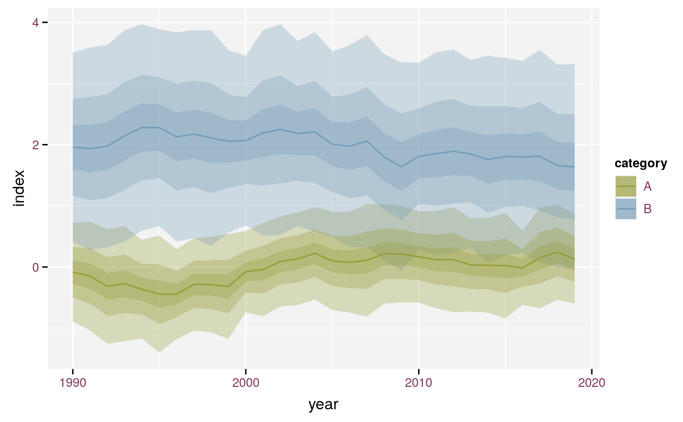
stat_fan() with different colours.
stat_effect() and scale_effect()
stat_effect() displays a symbol at the location defined by x and y. The symbol is define by comparing ymin and ymax with the reference and the threshold. It returns the unsigned, six level classification (see vignette("classification", package = "effectclass")). We prefer the unsigned classification as it has fewer levels and the plot shows the direction of the effect. The shape of the symbols is defined by scale_effect(), which displays all six classes even if not every class is present in the data. We selected the shapes to reflect the amount of uncertainty. We suggest to use a solid shape for no effect or a significant effect. A triangle give the impression of direction, so we use this shape for the strong effect. A circle seems a good symbol for no effect class because it gives no impression of direction. We represent the moderate effect by a diamond as it resembles a circle. The effect (without adjective) get a square as symbol. Hollow shapes represent the unknown (hollow circle) or potential effects (hollow diamond).
timeserie$lcl <- qnorm(0.05, timeserie$index, timeserie$s)
timeserie$ucl <- qnorm(0.95, timeserie$index, timeserie$s)
reference <- 1
thresholds <- reference + c(-1, 1) * 0.3
ggplot(timeserie, aes(x = year, y = index, ymin = lcl, ymax = ucl)) +
  geom_errorbar() +
  stat_effect(reference = reference, threshold = thresholds) +
  geom_hline(yintercept = c(reference, thresholds), linetype = c(2, 3, 3)) +
  scale_effect()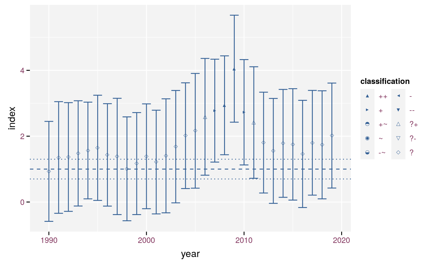
An example of stat_effect() and scale_effect().
It is possible to combine stat_fan() and stat_effect(). If you do so, we recommend to use the same confidence interval for both the classification and stat_fan. The widest interval of the three interval version stat_fan shows a 90% interval, whereas the nine interval version shows a 95% interval. Adding the thresholds helps the interpretations.
ggplot(timeserie, aes(x = year, y = index, ymin = lcl, ymax = ucl, link_sd = s)) +
  stat_fan() +
  stat_effect(reference = reference, threshold = thresholds) +
  geom_hline(yintercept = c(reference, thresholds), linetype = c(2, 3, 3)) +
  scale_effect("my title", drop = TRUE)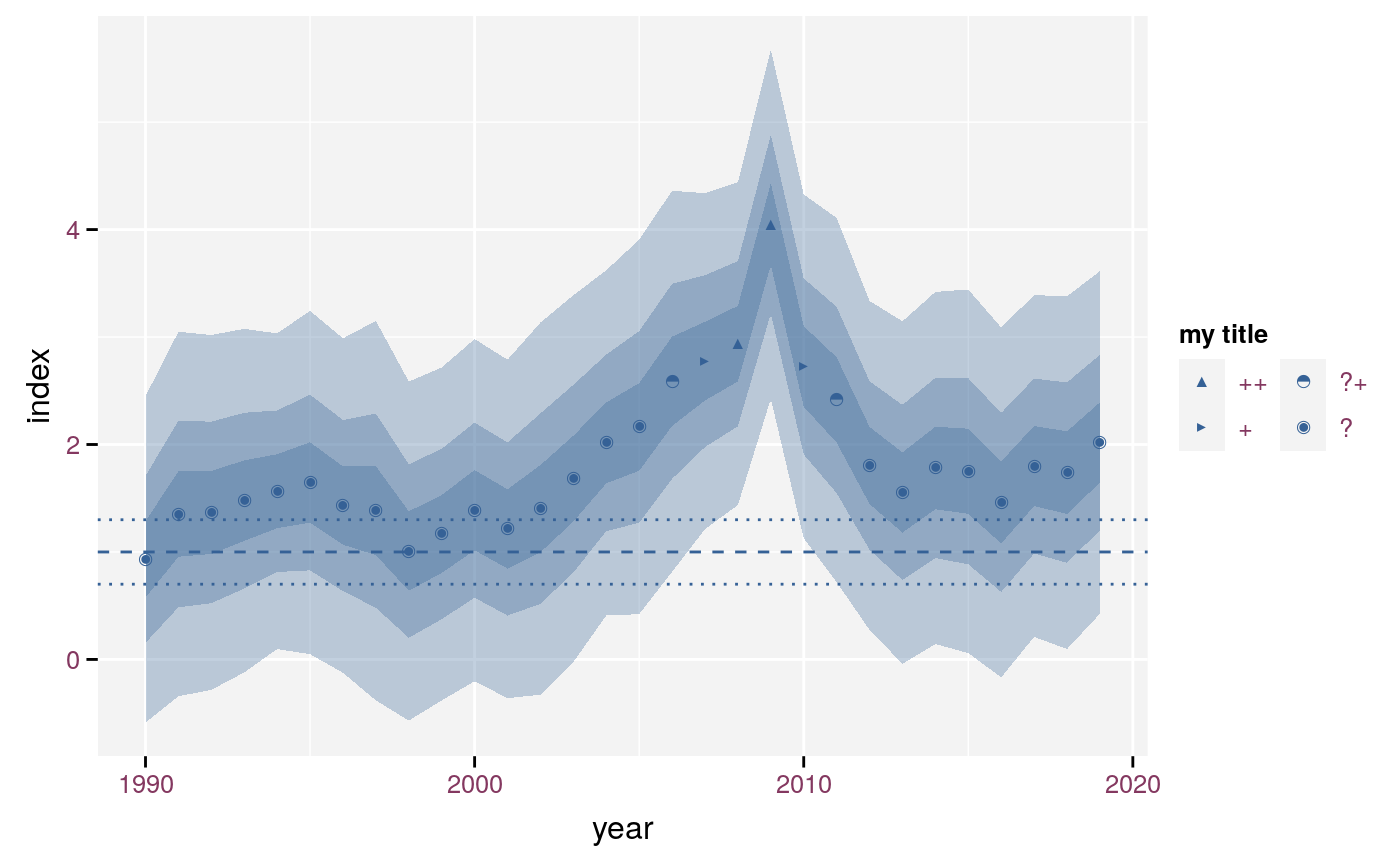
Combination of stat_effect and stat_fan with custom title and subset of classes.
When the x value is a discrete variable (e.g. model parameters), we cannot use stat_fan() as-is. In such case we recommend to add geom = "rect" or geom = "linerange" to stat_fan over using errorbars.
## Example taken from help("lm")
## Annette Dobson (1990) "An Introduction to Generalized Linear Models".
## Page 9: Plant Weight Data.
ctl <- c(4.17,5.58,5.18,6.11,4.50,4.61,5.17,4.53,5.33,5.14)
trt <- c(4.81,4.17,4.41,3.59,5.87,3.83,6.03,4.89,4.32,4.69)
group <- gl(2, 10, 20, labels = c("Control","Treatment"))
weight <- c(ctl, trt)
lm_D90 <- lm(weight ~ 0 + group) # omitting intercept
effect_D90 <- coef(summary(lm_D90))
effect_D90 <- as.data.frame(effect_D90[, 1:2])
colnames(effect_D90)[2] <- "SE"
effect_D90$parameter <- rownames(effect_D90)
effect_D90$parameter <- gsub("group", "", effect_D90$parameter)
effect_D90$LCL <- qnorm(0.05, effect_D90$Estimate, effect_D90$SE)
effect_D90$UCL <- qnorm(0.95, effect_D90$Estimate, effect_D90$SE)
ggplot(
effect_D90,
aes(x = parameter, y = Estimate, ymin = LCL, ymax = UCL, link_sd = SE)
) +
stat_fan(geom = "rect") +
stat_effect(threshold = c(4.5, 5.5), reference = 5) +
geom_hline(yintercept = c(5, 4.5, 5.5), linetype = c(2, 3, 3)) +
scale_effect("class")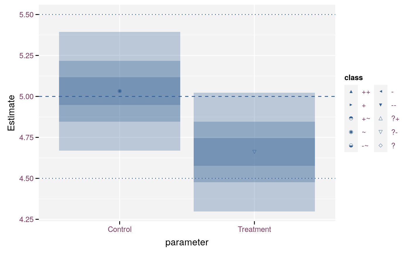
Model parameters of model with stat_fan and geom rect.
ggplot(
  effect_D90,
  aes(x = parameter, y = Estimate, ymin = LCL, ymax = UCL, link_sd = SE)
) +
  geom_errorbar() +
  stat_effect(threshold = c(4.5, 5.5), reference = 5) +
  geom_hline(yintercept = c(5, 4.5, 5.5), linetype = c(2, 3, 3)) +
  scale_effect("class")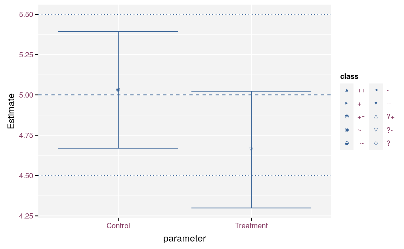
Model parameters with single errorbars.
ggplot(
  effect_D90,
  aes(x = parameter, y = Estimate, ymin = LCL, ymax = UCL, link_sd = SE)
) +
  stat_fan(geom = "linerange") +
  stat_effect(threshold = c(4.5, 5.5), reference = 5) +
  geom_hline(yintercept = c(5, 4.5, 5.5), linetype = c(2, 3, 3)) +
  scale_effect("class")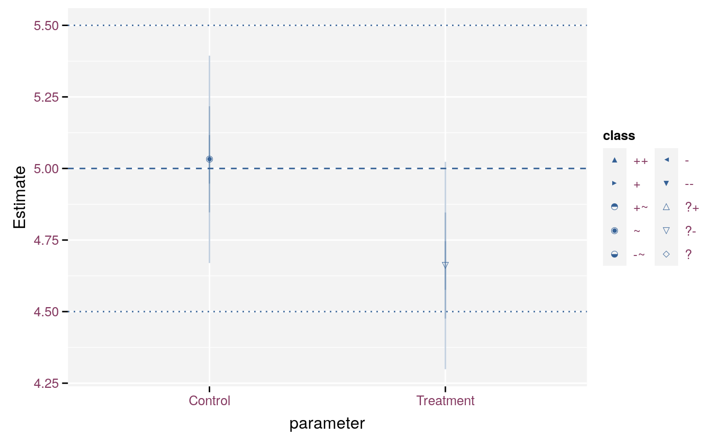
Model parameters with multiple lineranges.
ds <- data.frame(
  mean = c(0, 0.5, -0.5, 1, -1, 1.5, -1.5, 0.5, -0.5, 0),
  sd = c(1, 0.5, 0.5, 0.5, 0.5, 0.25, 0.25, 0.25, 0.25, 0.5)
)
ds$lcl <- qnorm(0.05, ds$mean, ds$sd)
ds$ucl <- qnorm(0.95, ds$mean, ds$sd)
ds$effect <- classification(ds$lcl, ds$ucl, 1)
ggplot(ds, aes(x = effect, y = mean, ymin = lcl, ymax = ucl, link_sd = sd)) +
  stat_fan(geom = "rect") +
  geom_hline(yintercept = 0, linetype = 2) +
  geom_hline(yintercept = c(-1, 1), linetype = 3) +
  stat_effect(threshold = 1) +
  scale_effect()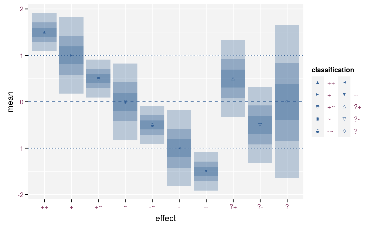
Symbols for a detailed and signed classification.
ggplot(ds, aes(x = effect, y = mean, ymin = lcl, ymax = ucl, link_sd = sd)) +
  stat_fan(geom = "rect") +
  geom_hline(yintercept = 0, linetype = 2) +
  geom_hline(yintercept = c(-1, 1), linetype = 3) +
  stat_effect(threshold = 1, signed = FALSE) +
  scale_effect(signed = FALSE)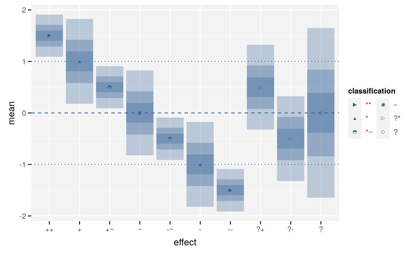
Symbols for a detailed and unsigned classification.
ggplot(ds, aes(x = effect, y = mean, ymin = lcl, ymax = ucl, link_sd = sd)) +
  stat_fan(geom = "rect") +
  geom_hline(yintercept = 0, linetype = 2) +
  geom_hline(yintercept = c(-1, 1), linetype = 3) +
  stat_effect(threshold = 1, detailed = FALSE) +
  scale_effect(detailed = FALSE)
Symbols for a coarse and signed classification.
ggplot(ds, aes(x = effect, y = mean, ymin = lcl, ymax = ucl, link_sd = sd)) +
  stat_fan(geom = "rect") +
  geom_hline(yintercept = 0, linetype = 2) +
  geom_hline(yintercept = c(-1, 1), linetype = 3) +
  stat_effect(threshold = 1, detailed = FALSE, signed = FALSE) +
  scale_effect(detailed = FALSE, signed = FALSE)
Symbols for a coarse and unsigned classification.
format_ci() and classification()
When presenting effects in a tabular format we recommend to display the effect with its confidence interval in conjunction with the classification of the effect. Sort the rows of the table in a way that provides maximum information. E.g. sort first on the classification and then on the estimate. This will place the least informative effects at the bottom of the table. The table starts with a gradient from the strongest positive effects, over no effect to the strongest negative effects.
The effectclass package provides format_ci(), which formats the estimate and its confidence interval as text. It automatically rounds the numbers to a sensible magnitude depending on the width of the confidence interval. The table below gives an example on how the estimate and its confidence interval gets translated into a classification and formatted text. In practice we would only publish the classification and the formatted text.
| estimate | lcl | ucl | classifcation | formatted |
|---|---|---|---|---|
| 4.7123890 | 4.6959404 | 4.7288375 | ++ |
4.712 (4.696; 4.729) |
| 4.7123890 | 4.5479036 | 4.8768743 | ++ |
4.71 (4.55; 4.88) |
| 5.4977871 | 5.4813386 | 5.5142357 | ++ |
5.498 (5.481; 5.514) |
| 5.4977871 | 5.3333018 | 5.6622725 | ++ |
5.50 (5.33; 5.66) |
| 6.2831853 | 6.2667368 | 6.2996338 | ++ |
6.283 (6.267; 6.300) |
| 6.2831853 | 6.1186999 | 6.4476707 | ++ |
6.28 (6.12; 6.45) |
| 6.2831853 | 4.6383317 | 7.9280389 | ++ |
6.3 (4.6; 7.9) |
| 3.9269908 | 3.7625055 | 4.0914762 | + |
3.93 (3.76; 4.09) |
| 4.7123890 | 3.0675354 | 6.3572426 | + |
4.7 (3.1; 6.4) |
| 5.4977871 | 3.8529335 | 7.1426408 | + |
5.5 (3.9; 7.1) |
| 3.1415927 | 3.1251441 | 3.1580412 | +~ |
3.142 (3.125; 3.158) |
| 3.9269908 | 3.9105423 | 3.9434394 | +~ |
3.927 (3.911; 3.943) |
| 3.1415927 | 2.9771073 | 3.3060780 | ~ |
3.14 (2.98; 3.31) |
| 2.3561945 | 2.3397460 | 2.3726430 | -~ |
2.356 (2.340; 2.373) |
| 2.3561945 | 2.1917091 | 2.5206799 | -~ |
2.36 (2.19; 2.52) |
| 0.7853982 | -0.8594555 | 2.4302518 | - |
0.8 (-0.9; 2.4) |
| 0.0000000 | -0.0164485 | 0.0164485 | -- |
0.0000 (-0.0164; 0.0164) |
| 0.0000000 | -0.1644854 | 0.1644854 | -- |
0.000 (-0.164; 0.164) |
| 0.0000000 | -1.6448536 | 1.6448536 | -- |
0.00 (-1.64; 1.64) |
| 0.7853982 | 0.7689496 | 0.8018467 | -- |
0.785 (0.769; 0.802) |
| 0.7853982 | 0.6209128 | 0.9498835 | -- |
0.79 (0.62; 0.95) |
| 1.5707963 | 1.5543478 | 1.5872449 | -- |
1.5708 (1.5543; 1.5872) |
| 1.5707963 | 1.4063110 | 1.7352817 | -- |
1.571 (1.406; 1.735) |
| 3.9269908 | 2.2821372 | 5.5718444 | ?+ |
3.9 (2.3; 5.6) |
| 1.5707963 | -0.0740573 | 3.2156500 | ?- |
1.6 (-0.1; 3.2) |
| 0.0000000 | -18.0933899 | 18.0933899 | ? |
0.0 (-18.1; 18.1) |
| 0.7853982 | -17.3079917 | 18.8787881 | ? |
0.8 (-17.3; 18.9) |
| 1.5707963 | -16.5225936 | 19.6641862 | ? |
1.6 (-16.5; 19.7) |
| 2.3561945 | 0.7113409 | 4.0010481 | ? |
2.4 (0.7; 4.0) |
| 2.3561945 | -15.7371954 | 20.4495844 | ? |
2 (-16; 20) |
| 3.1415927 | 1.4967390 | 4.7864463 | ? |
3.1 (1.5; 4.8) |
| 3.1415927 | -14.9517972 | 21.2349826 | ? |
3 (-15; 21) |
| 3.9269908 | -14.1663991 | 22.0203807 | ? |
4 (-14; 22) |
| 4.7123890 | -13.3810009 | 22.8057789 | ? |
5 (-13; 23) |
| 5.4977871 | -12.5956028 | 23.5911770 | ? |
5 (-13; 24) |
| 6.2831853 | -11.8102046 | 24.3765752 | ? |
6 (-12; 24) |